
")
Graphs are visual representations of data that make it easier to understand and interpret information.
Key Concepts:
- Bar graphs: Used to compare different categories of data.
- Pie charts: Used to represent parts of a whole.
- Line graphs: Used to show how data changes over time.
- Histograms: Used to represent data in intervals.
- Coordinates: Ordered pairs of numbers used to locate points on a graph.
- Linear graphs: Represent data that changes at a constant rate.
Importance:
- Graphs help in understanding data quickly and easily.
- They can be used to compare different sets of data.
- Graphs are used in various fields like science, economics, and social studies.
By understanding graphs, you can effectively analyze and interpret information presented in a visual format.
Exercise 13.1
1. The following graph shows the temperature of a patient in a hospital, recorded every hour.
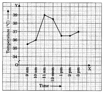
(a) What was the patient’s temperature at 1 pm?
(b) When was the patient’s temperature 38.5°C?
(c) The patient’s temperature was the same two times during the period given. What were the two times?
(d) What was the temperature at 1:30 pm? How did you arrive at your answer?
(e) During which periods did the patient’s temperature show an upward trend?
Ans :
(a) At 1 pm, the patient’s temperature was 36.5°C.
(b) At 12:00 noon, the patient’s temperature was recorded at 38.5°C.
(c) The patient’s temperature remained consistent at 36.5°C at both 1 pm and 2 pm.
(d) At 1:30 pm, the temperature was 36.5°C. This value was determined by taking the midpoint between 1 pm and 2 pm and extending perpendicularly upward to intersect the horizontal line indicating 36.5°C.
(e) Between 9 am to 10 am and 10 am to 11 am, the temperature showed an upward trend.
2. The following line graph shows the yearly sales figures for a manufacturing company.
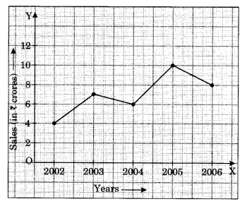
(a) What were the sales in (i) 2002 (ii) 2006?
(b) What were the sales in (i) 2003 (ii) 2005?
(c) Compute the difference between the sales in 2002 and 2006.
(d) In which year was there the greatest difference between the sales as compared to its previous year?
Ans :
(a)
(i) The sales in the year 2002 was 4 crores.
(ii) The sales in the year 2006 was 8 crores.
(b)
(i) The sales in the year 2003 was 7 crores.
(ii) The sales in the year 2005 was 10 crores.
(c)
The difference between the sales in 2002 (4 crores) and 2006 (8 crores) is 4 crores (8 crores – 4 crores = 4 crores).
(d)
To find the year with the greatest difference in sales, we need to compare the sales of each year with its previous year:
- Difference between sales of 2003 and 2002: 7 crores – 4 crores = 3 crores
- Difference between sales of 2004 and 2003: 6 crores – 7 crores = -1 crore (decrease)
- Difference between sales of 2005 and 2004: 10 crores – 6 crores = 4 crores
- Difference between sales of 2006 and 2005: 8 crores – 10 crores = -2 crores (decrease)
The greatest difference (in absolute value) is in the year 2005, with a difference of 4 crores compared to its previous year (2004).
3. For an experiment in Botany, two different plants, plant A and plant B, were grown under similar laboratory conditions. Their heights were measured at the end of each week for 3 weeks. The results are shown by the following graph.
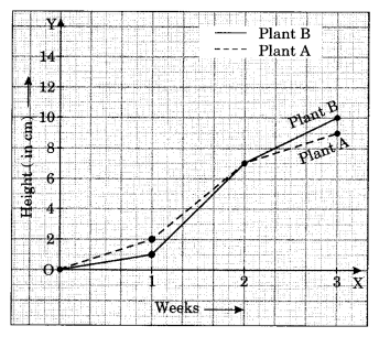
(a) How high was plant A after (i) 2 weeks (ii) 3 weeks
(b) How high was plant B after (i) 2 weeks (ii) 3 weeks
(c) How much did plant A grow during the 3rd week?
(d) How much did plant B grow from the end of the 2nd week to the end of the 3rd week?
(e) During which week did plant A grow most?
(f) During which week did plant B grow least?
(g) Were the two plants of the same height during any week shown here? Specify.
Ans :
(a)
- (i) After 2 weeks, Plant A was approximately 7 cm high.
- (ii) After 3 weeks, Plant A was approximately 9 cm high.
(b)
- (i) After 2 weeks, Plant B was approximately 7 cm high.
- (ii) After 3 weeks, Plant B was approximately 10 cm high.
(c)
- At the end of the 2nd week, Plant A was 7 cm high.
- At the end of the 3rd week, Plant A was 9 cm high.
- So, Plant A grew 9 cm – 7 cm = 2 cm during the 3rd week.
(d)
- At the end of the 2nd week, Plant B was 7 cm high.
- At the end of the 3rd week, Plant B was 10 cm high.
- So, Plant B grew 10 cm – 7 cm = 3 cm from the end of the 2nd to the 3rd week.
(e)
- Plant A grew from 0 to 2 cm in the first week, 5 cm to 7 cm in the second week, and 7 cm to 9 cm in the third week.
- So, Plant A grew the most in the second week.
(f)
- Plant B grew from 0 to 3 cm in the first week, 3 cm to 7 cm in the second week, and 7 cm to 10 cm in the third week.
- So, Plant B grew the least in the first week.
(g)
- Yes, the two plants were of the same height at the end of the second week, both measuring 7 cm.
4. The following graph shows the temperature forecast and the actual temperature for each day of a week.
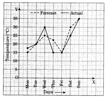
(a) On which days was the forecast temperature the same as the actual temperature?
(b) What was the maximum forecast temperature during the week?
(c) What was the minimum actual temperature during the week?
(d) On which day did the actual temperature differ the most from the forecast temperature?
Ans :
(a) On Tuesday, Friday, and Sunday, the forecasted temperatures matched the actual temperatures, which were 20°C, 15°C, and 35°C, respectively.
(b) The highest forecasted temperature for the week was 35°C.
(c) The lowest actual temperature recorded during the week was 17.5°C.
(d) The greatest difference between the forecasted and actual temperatures occurred on Thursday, with a variance of 7.5°C (22.5°C – 15°C).
5. Use the tables below to draw linear graphs.
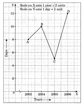
(a) The number of days a hillside city recovered show in different years.
| Year | 2003 | 2004 | 2005 | 2006 |
| Days | 8 | 10 | 5 | 12 |
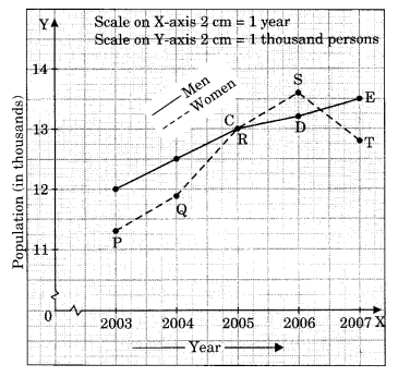
(b) Population (in thousands) of men and women in a village is different years.
| Year | 2003 | 2004 | 2005 | 2006 | 2007 |
| Number of men | 12 | 12.5 | 13 | 13.2 | 13.5 |
| Number of women | 11.3 | 11.9 | 13 | 13.6 | 12.8 |
Ans :
6. A courier-person cycle from a town to a neighbouring suburban area to deliver a parcel to the merchant. His distance from the town at different times is shown by the following graph.
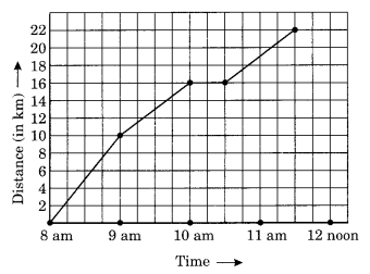
(a) What is the scale taken for the time axis?
(b) How much time did the person take for travel?
(c) How far is the place of the merchant from the town?
(d) Did the person stop on his way? Explain?
(e) During which period did he ride fastest?
Ans :
(a)
On the time axis, each gap represents 1 hour. Therefore, the scale for the time axis is 1 unit = 1 hour.
(b)
The person started the journey at 8 AM and reached the destination at 11:30 AM. So, the total time taken for travel is 3 hours and 30 minutes.
(c)
The final point on the graph represents the distance of the merchant’s place from the town. This point corresponds to 22 km on the distance axis. Therefore, the place of the merchant is 22 km from the town.
(d)
Yes, the person stopped on his way. This is indicated by the horizontal part of the graph between 10 AM and 10:30 AM. During this time, the distance covered remained constant, implying that the person was not moving.
(e)
The person rides fastest when the line on the graph is steepest. This occurs between 8 AM and 9 AM. Therefore, the person rode fastest during the period 8 AM to 9 AM.
7. Can there be a time-temperature graph as follows? Justify your answer.
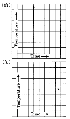
Ans :
(i) This graph depicts a time-temperature relationship where the temperature rises as time progresses.
(ii) This graph illustrates a time-temperature trend where the temperature drops as time advances.
(iii) This does not represent a valid time-temperature graph, as it shows temperature increasing consistently over time, which is not realistic.
(iv) This graph represents a scenario where the temperature stays constant even as time continues to increase.
Exercise 13.2
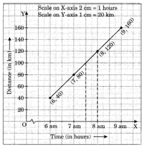
1. Draw the graphs for the following tables of values, with suitable scales on the axes.
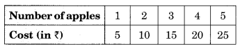
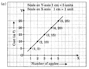
(a) Cost of apples
(b) Distance travelled by car.
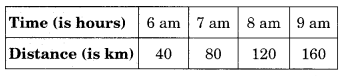
(i) How much distance did the car cover during the period 7:30 am to 8 am?
(ii) What was the time when the car had covered a distance of 100 km since its start?
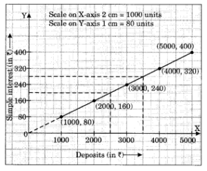
(c) Interest on deposits for a year.
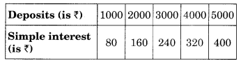
(i) Does the graph pass through the origin?
(ii) Use the graph to find the interest on ? 2500 for a year.
(iii) To get an interest of t 280 per year, how much money should be deposited?
Ans :
(b) (i) The car traveled a distance of 20 km between 7:30 am and 8 am, calculated as (120 km – 100 km).
(ii) By 7:30 am, the car had covered 100 km.
(c) (i) Yes, the graph does pass through the origin.
(ii) The interest on ₹2500 is ₹200 for one year.
(iii) To earn an interest of ₹280, an investment of ₹3500 is required.
2. Draw the graph for the following:
Ans :
